Designers' Top Pick for Kitchen Paint Colors
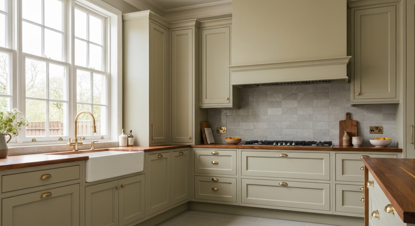
The kitchen is one of the most frequently painted rooms in any home — and one of the most challenging to get right. The Painting Pro Guys has completed kitchen painting projects in thousands of homes across Austin, Dallas, Houston, Phoenix, Denver, Nashville, Charlotte, and Atlanta since 2007. Color choice in a kitchen carries more weight than in most rooms because the kitchen is where people gather, where meals are prepared, and in many homes, where the day begins and ends. Getting the color right makes the space feel inspiring. Getting it wrong makes it feel like a room you want to leave.
According to designers, natural colors and neutrals are the best for a kitchen. Every homeowner wants a neat and elegantly looking area so they can be more inspired to whip up a delicious meal for family and friends. Neutral colors satisfy many purposes like providing cheer, reflecting light, and attracting potential buyers to purchase the house. Cool colors like blue, green, and purple don't create the urge for hunger, so they are not given priority while painting the kitchen. Colors that are conducive are an excellent choice for the kitchen.
Color psychology plays a particularly strong role in kitchens because the space is tied to appetite, energy, and social connection. Warm colors — reds, oranges, and yellows — are appetite-stimulating and energizing, which is why they dominate restaurant interiors and why designers favor them for kitchens. Cool colors like blue and purple are considered appetite-suppressing, which is why they rank lower on the designer recommendation list for this specific room.
Here is a list of seven best color schemes to beautify your kitchen:
The 7 Best Kitchen Paint Color Schemes
Any color can become a neutral just by adding enough of the white shade. The amount of white color depends on the tint of the concerned color you want. The best part about using neutrals is that you can never go completely wrong by using them. Neutral colors may seem as dull but, by adding red, orange or a yellow color you can charm them up.
Neutrals are the designer default for kitchens for good reason — they work with virtually any cabinet color, hardware finish, and flooring material, and they photograph well for resale. The range within neutrals is enormous: from bright white-leaning off-whites to warm greiges and deep taupes. The key is to choose a neutral with the right undertone for your kitchen's fixed elements. A neutral with warm undertones (yellow, orange, or red base) will feel inviting alongside natural wood cabinetry. A neutral with cool undertones (gray or green base) will feel crisp alongside white or painted cabinets.
Pro tip: "Greige" — a blend of gray and beige — is consistently one of the most popular neutral kitchen choices because it reads as warm in morning light and more sophisticated in evening artificial light.
Brown is a shade of earthy colors and is a critical part of cozy kitchens. Brown reminds you of the place where your food grows i.e. earth or profoundly speaking, farm. Brown can also be teamed up with a white tint to make it a neutral color. The important thing with using brown color is that you need to match it up with your kitchen cabinets to add a little bit of missing sparkle to it.
Brown in the kitchen works best when it functions as a grounding element rather than the dominant statement color. Warmer shades of brown — terracotta, cinnamon, and sienna — pair naturally with cream or white upper cabinets and create a farmhouse warmth that photographs beautifully and feels genuinely welcoming. The lighter you go with brown, the more versatile it becomes: a warm tan or caramel on kitchen walls pairs with almost any wood tone in cabinetry without creating a heavy or dark feeling in the space.
Pro tip: If your kitchen cabinets are already a medium to dark wood tone, keep the walls on the lighter side of the brown spectrum — a warm tan or light terracotta rather than a deep chocolate — to avoid the room feeling visually heavy.
Bright yellow is the perfect pick for a kitchen. It plays between the lines of being straightforward and trendy at the same time. Yellow adds the much-needed brightness to the room and makes it more appealing to the customer. You should probably go for pale yellow or a light olive paint. The best thing about using yellow is that it complements with any kitchen furniture you may have. Deeper yellows with a smidge of black can help to recreate a traditional kitchen.
Yellow is one of the most forgiving kitchen colors because it reflects light and makes any kitchen feel brighter and larger than it actually is — an especially valuable quality in smaller kitchens or those with limited natural light. The key is saturation: the more muted and pale the yellow, the more versatile and enduring it is. Saturated, bright yellows can feel cheerful in small doses but overwhelming when applied to all four walls of a kitchen. A pale lemon or warm cream-yellow applied to walls with white trim and natural wood accents is one of the most reliably well-received kitchen color combinations across markets from Austin to Charlotte.
Pro tip: Test yellow paint samples under your kitchen's specific lighting before committing. Yellow is one of the most light-sensitive paint colors — it can read as greenish under cool fluorescent light and as warm gold under incandescent light.
White gives you the classiest of kitchens. White is a look; it's a thought. All-white kitchen compiles of white walls, white ceiling, and white cabinets; anything and everything painted in white. You should only use all-white color in a premium kitchen. A cheap kitchen will never give the classic look with white color so you should go for a colorful kitchen then.
The all-white kitchen is an enduring design statement that photographs exceptionally well, feels spacious regardless of the actual square footage, and is consistently attractive to buyers at resale. The challenge is that all-white is unforgiving — it highlights imperfections in walls and cabinetry, shows marks and stains more readily than other color schemes, and requires higher-quality finishes and materials to look intentional rather than cheap. If you have well-constructed cabinetry, solid hardware, and quality countertops, all-white is one of the highest-impact color choices you can make. In a builder-grade kitchen with standard finishes, a warm neutral or pale yellow will serve you better and be far easier to maintain.
Pro tip: Pure bright white can feel clinical in a kitchen. Most designers prefer off-whites and soft warm whites — like Benjamin Moore White Dove or Sherwin-Williams Alabaster — which carry warmth without straying from the all-white aesthetic.
A red decorated kitchen adds a flavor of spice to the surroundings. Red as a kitchen color adds spark to the kitchen. Red gives your kitchen a modern look and adds gloom to a kitchen with stainless steel and plenty of dark colors.
Red is the most overtly appetite-stimulating color in the spectrum — there is a reason it appears so frequently in fast-food branding and restaurant interiors. In the home kitchen, red works best used with restraint: as an accent wall behind open shelving, on lower cabinets against white upper cabinets, or as a bold statement in a kitchen that opens to a dining room where the color can be appreciated from multiple angles. Deep, muted reds — burgundy, brick, and cranberry — tend to be more livable long-term than saturated primary red, which can become visually fatiguing when used on all four walls of a kitchen.
Pro tip: Red pairs exceptionally well with stainless steel appliances and natural wood accents. If your kitchen has stainless steel hardware or appliances and dark wood floors or cabinetry, a deep red on the walls can bring the whole space together dramatically.
Green color gives you calmness while working in the kitchen. It can turn up your stomach but at the same time, it hard to sell. A light shade of green looks better in the kitchen instead of a dark green shade.
Light sage green has had a significant resurgence in kitchen popularity and for good reason — it pairs naturally with warm wood tones, feels fresh without being stark, and creates a calming environment that makes cooking feel less rushed. The key is shade selection: medium to dark greens can make a kitchen feel closed in and are harder to resell, whereas soft sage, mint, and celadon tones feel open, airy, and broadly appealing. If you love green but plan to sell the home in the near future, a sage green on the walls with white trim is one of the safer bold choices you can make — it reads as on-trend but not polarizing.
Pro tip: Light green works particularly well in kitchens with white subway tile backsplash and brushed brass or matte black hardware. These combinations are consistently popular in Nashville, Austin, and Charlotte markets where we work regularly.
Blue is considered as a 'downer' color and is believed to kill your hunger. Blue is supposed not to stimulate your appetite, but the thing about blue color is that it provides a vintage look. If your kitchen and dining room are separated, then you can go for flashy blue color in your kitchen.
Navy blue and deep slate blue have become increasingly popular as kitchen cabinet colors rather than wall colors — particularly in urban markets like Houston, Denver, and Phoenix where homeowners want distinctive, design-forward interiors. A navy island against white perimeter cabinets, or deep blue lower cabinets with white upper cabinets, delivers the vintage look and visual drama of blue without covering the entire room in a color that suppresses appetite. If you want blue on the walls, lighter and warmer versions of blue — soft periwinkle, dusty blue, or pale French blue — are more flattering in a kitchen than saturated or cool blues.
Pro tip: If your kitchen and dining room are open-plan, consider reserving blue for accent elements like an island or a single accent wall rather than all four walls — this keeps the dining area from feeling like an appetite-suppressing environment.
A thing to note is that this list goes on changing with time. But, the given colors will always remain in the top pick whenever there is a talk about kitchen painting.
Kitchen Paint Colors at a Glance
| Color Scheme | Appetite Effect | Resale Appeal | Best For |
|---|---|---|---|
| Neutrals | Positive | Excellent | Any kitchen — the safest and most versatile choice |
| Brown / Earthy | Warm and inviting | Good | Farmhouse, traditional, and rustic kitchen styles |
| Bright Topaz / Yellow | Energizing | Good | Small kitchens, north-facing rooms with limited light |
| All-White | Clean and fresh | Excellent | Premium kitchens with quality finishes and cabinetry |
| Red | Highly stimulating | Selective | Bold accent walls, lower cabinets, kitchens with stainless steel |
| Light Green / Sage | Calming | Good | Modern farmhouse, nature-inspired, transitional kitchens |
| Blue | Suppressing | Selective | Kitchens separated from dining, cabinet accents, vintage styles |
The Right Paint Finish for Your Kitchen
Color is only half the decision — finish matters just as much in a kitchen environment. Kitchens are the highest-demand surface in any home for paint durability: grease, steam, cleaning agents, and constant contact all degrade paint faster here than anywhere else in the house.
Walls: Semi-gloss or satin. Both are easy to wipe down after cooking splatter and resist moisture from steam. Semi-gloss is more durable and easier to clean; satin hides wall imperfections better.
Cabinets: Enamel paint. It cures to a hard shell that stands up to the constant contact, cleaning, and humidity that kitchen cabinets endure.
Ceiling: Flat white. Reduces light glare from kitchen lighting and hides grease-related discoloration that ceilings accumulate over time.
Trim and molding: Semi-gloss. Clean, defined, and easy to wipe.
The best kitchen paint color is one that works with your specific cabinetry, your hardware finish, your flooring, and the amount of natural light your kitchen receives. Designer lists provide excellent starting points, but your kitchen's fixed elements narrow the field considerably before you pick up a color swatch. The Painting Pro Guys includes a free color consultation with every kitchen painting project across 50+ US cities — from Austin and Dallas to Denver, Nashville, Phoenix, and Atlanta. We bring samples to your home and help you choose a color that works with everything already in the room.
The Painting Pro Guys includes a free in-home color consultation with every interior painting project. We assess your kitchen's lighting, cabinets, and hardware in person and help you choose with confidence. Schedule your free estimate today →
The Painting Pro Guys
The Painting Pro Guys has been delivering expert residential and commercial painting services across the United States since 2007. With thousands of completed projects and a 4.9-star rating across 2,400+ verified reviews, we share what we know so homeowners can make smart, confident decisions about their homes.