How to Pick the Perfect Paint Color for Every Room in Your Home
How to Pick the Perfect Paint Color
for Every Room — Step by Step
Undertones, lighting, fixed finishes, and testing — the complete process
Choosing a paint color sounds simple until you are standing in front of hundreds of chips at the paint store with no idea which one is right for your room. The paralysis is real — and it leads most homeowners to either pick something safe they are not excited about, or commit to a color they love in the store that looks completely different on their walls.
The good news is that choosing paint colors well is a learnable process. It is not about artistic talent or natural design instinct — it is about understanding a handful of concepts that professional color consultants apply on every project. This guide walks through all of them.
THE FOUNDATION RULE
Do not start with the paint. Start with the fixed elements in your room — flooring, countertops, furniture, tile — and work backward to find colors that complement them. Paint is the most flexible element in any room. Everything else is already decided.
Step 1 — Catalogue Your Fixed Finishes
Before looking at a single paint chip, do this one thing: identify every element in the room that is not changing. This includes flooring material and color, countertops, tile, cabinetry, built-ins, major furniture pieces, and any fixed hardware or fixtures.
Write them down or take photos. Then look at them together — not individually. What colors are present? What undertones do you see? Are the fixed elements warm (yellow, orange, red undertones), cool (blue, green, gray undertones), or neutral?
Your paint needs to work with this existing palette. A paint color that looks beautiful in isolation can clash dramatically with your fixed finishes. A color that seems boring in a chip can sing when it is harmonizing with the right floor and furniture.
Step 2 — Understand Undertones
Undertones are the single most important concept in paint color selection — and the one most homeowners overlook entirely. Every paint color has an undertone: a subtle secondary color that lives beneath the primary color. It shows up most prominently in large quantities and under specific lighting conditions.
- White paint can appear pink, yellow, green, blue, or gray depending on its undertone
- Gray paint can pull purple, blue, green, or brown
- Beige and greige can lean yellow, orange, pink, or true neutral
- Green can pull blue, yellow, or gray
To identify an undertone, hold the chip next to a true neutral white. The difference reveals the undertone direction. Then hold the chip next to your fixed finishes. If the undertones are compatible — both warm, or both cool — the colors will harmonize. If they fight each other, you will feel that tension in the room every day.
THE MOST COMMON MISTAKE
Choosing a paint color that looked warm and inviting in the store, only to discover it looks pink or purple on your walls. This happens because store lighting is fluorescent and flat — it suppresses undertones. Always view paint colors in your home's actual lighting before committing.
Step 3 — Assess Your Room's Lighting
Lighting changes everything about how a paint color looks. The same paint chip looks different in a north-facing room versus a south-facing room, under incandescent versus LED bulbs, in the morning versus the afternoon.
NORTH-FACING ROOMS
Colors appear slightly blue and flat. Warm undertones — yellow, orange, red — help counteract the coolness. Avoid cool grays and blues which can feel cold and clinical.
SOUTH-FACING ROOMS
Most forgiving light for color. Nearly any palette works. Cool colors feel comfortable rather than cold. Even saturated colors look balanced in south-facing light.
EAST-FACING ROOMS
Colors look their best in the morning and progressively cooler through the afternoon. Consider how you use the room — a breakfast room in an east-facing space will always look inviting.
WEST-FACING ROOMS
Colors look cooler in the morning and dramatically warmer in the evening. Rooms used most in the evening benefit from this light. Orange and yellow undertones are amplified late in the day.
Step 4 — The 6-Step Color Selection Process
Start with the most fixed room
If your home has an open plan, start color selection in the room with the most fixed elements — typically the kitchen or main living area. These rooms anchor the palette for the whole house.
Select a palette of 3 to 5 colors
Rather than choosing colors room by room in isolation, select a palette of 3 to 5 colors from the same family or with compatible undertones. Distribute these across rooms to create visual coherence while providing variety.
Apply the 60-30-10 principle
In any room: 60 percent dominant color (walls), 30 percent secondary color (furniture, rugs, textiles), 10 percent accent (accessories, art, a single piece of furniture). This proportion creates balance without monotony.
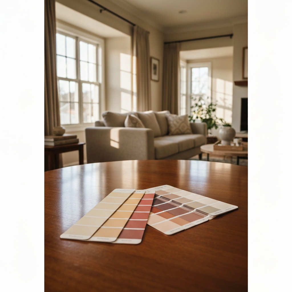
Get large physical samples
Do not make final decisions from small chips. Get large sample cards (most paint brands offer 8x8 inch or larger samples) or buy small sample pots and paint a 12x12 inch test area directly on your wall.
Observe in multiple lighting conditions
Check your test patch in morning light, midday light, afternoon light, and at night under artificial light. Colors shift significantly across these conditions. Live with it for at least two days before deciding.
Check the transitions between rooms
Stand in the doorway between adjacent rooms and assess how the colors read together. They do not need to match, but they should transition without visual friction. Colors that share undertones flow naturally even at very different values.
Room-by-Room Color Recommendations
| Room | Color Direction | Why It Works |
|---|---|---|
| Living Room | Warm whites, soft greiges, sage green | Creates welcoming, relaxed environment for extended time in the space |
| Master Bedroom | Muted blues, soft taupes, warm neutrals | Calming tones promote rest; warmer neutrals feel comfortable and personal |
| Kitchen | Warm whites, soft yellows, light sage | Bright, clean feel; works with most cabinet and countertop materials |
| Bathroom | Soft blues, warm whites, light gray-green | Clean, spa-like feel; cool tones complement fixtures and tile |
| Dining Room | Deeper tones, terracotta, navy, forest green | Rich colors create drama and intimacy for an intentional gathering space |
| Home Office | Deep greens, charcoal, warm navy | Focused, purposeful feel; dark tones reduce visual distraction |
| Kids Room | Medium saturation, any direction | Avoid very dark (hard to paint over) or very bright (visually stimulating for sleep) |
| Hallways | Continuation of adjacent room, slightly lighter | Maintain flow; hallways read as transitions and benefit from coherence |
Common Color Selection Mistakes to Avoid
Mistakes That Lead to Colors You Regret
- Choosing under store lighting. Fluorescent store lighting suppresses undertones and makes colors look flatter and more neutral than they are in your home. Always view in your actual space.
- Deciding from a small chip. A 2-inch chip gives you almost no information about how a color will read in large quantities on four walls. Always test large.
- Ignoring undertones in fixed finishes. Choosing a "greige" that looks warm in isolation but pulls pink next to your cool-toned tile is a common and painful mistake.
- Choosing rooms in isolation. Colors that look great in each room individually can clash when you see them together from adjacent spaces. Always plan the whole palette together.
- Matching paint to a fabric swatch. Fabric and paint reflect light completely differently. A paint that appears to match a sofa cushion in your hand will rarely match on the wall.
- Following trends over your space. A trending color that works beautifully in a magazine photo may not work in your home with your lighting, finishes, and furniture. Trends are inspiration, not prescription.
THE PRO GUYS TAKE
Color selection is the step homeowners most often rush — and the one most likely to cause regret. Our color consultants bring large physical swatches to your home, assess your lighting and fixed finishes in person, and guide you through the selection process before any paint goes on. It is included free with every painting project we complete — across all 50+ US cities we serve.
FREE IN-HOME COLOR CONSULTATION
The Painting Pro Guys includes a free in-home color consultation with every painting project. We bring samples, assess your actual space, and help you make a decision you will be happy with for years. Schedule your free estimate today →
The Painting Pro Guys
The Painting Pro Guys has been delivering expert residential and commercial painting services across the United States since 2007. With thousands of completed projects and a 4.9-star rating across 2,400+ verified reviews, we share what we know so homeowners can make smart, confident decisions about their homes.
We Help You Choose — In Your Home
Our color consultants bring samples to your home, assess your actual lighting and finishes, and guide you to colors you will love. Included free with every project.